


Why I Love Payne’s Gray Acrylic Paint
Updated: Aug 27
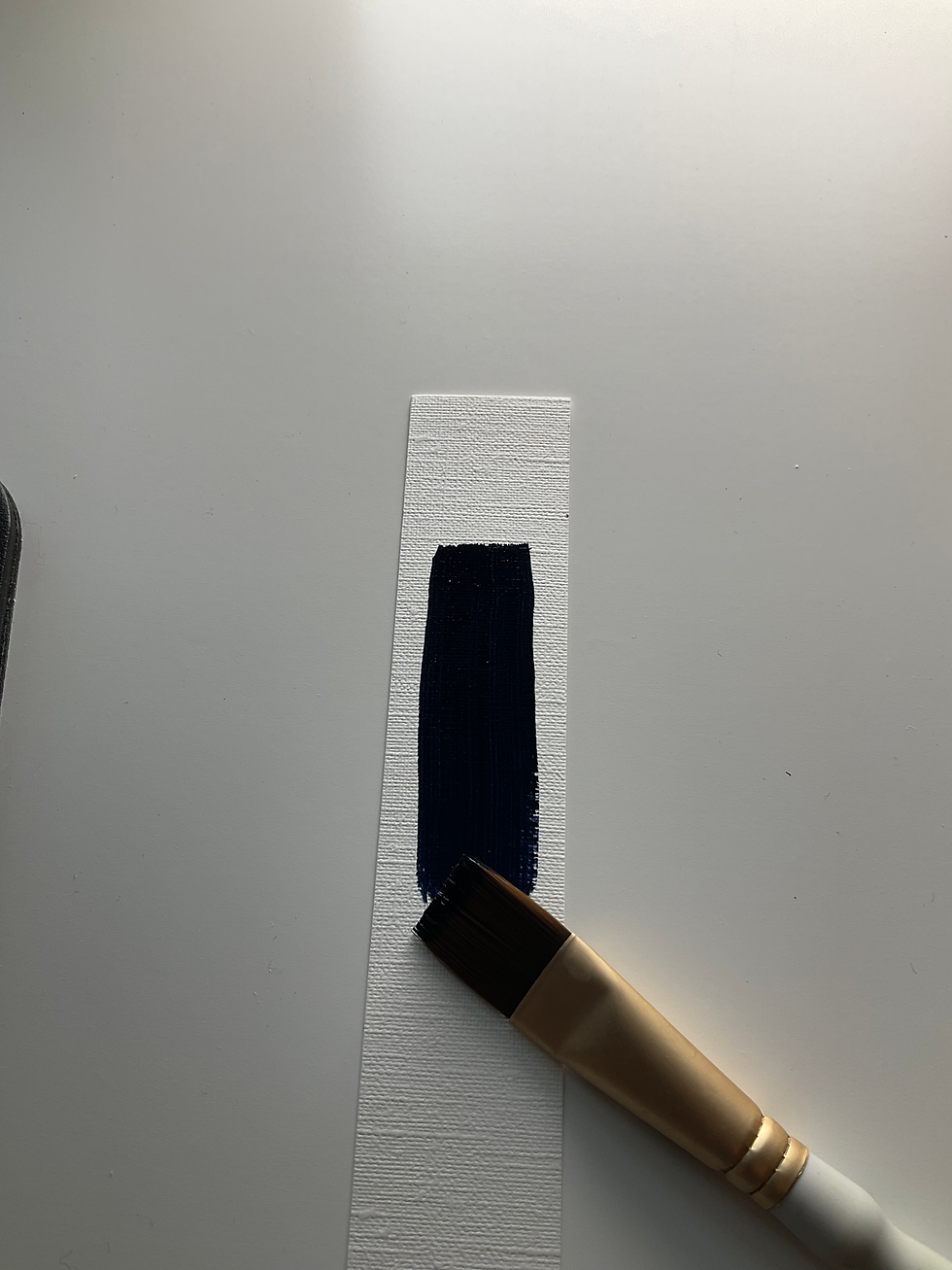
There are some colours that seem to find their way into almost every painting, and for me, Payne’s Gray is one of them.
It’s one of those wonderfully versatile colours that can do so much more than simply create a dark grey. I use it when I want depth, shadows and darker colour without the harshness that can sometimes come from using straight black.
Dark Without Being Harsh
One of my favourite things about Payne’s Gray is that it gives me a beautiful deep, cool dark without feeling as severe as black.
Golden’s Payne’s Gray is made from ultramarine blue and carbon black. Golden describes it as being easier to control and less intense than black as a mixing colour—and I completely understand why. When I’m painting colourful subjects, that matters. I want my darks to support the colour around them rather than flatten everything.
A Wonderful Shadow Colour
Payne’s Gray is particularly useful for shadows.
Instead of automatically reaching for black, I can use Payne’s Gray to create a cooler, softer-looking shadow. It works beautifully in landscapes, buildings, water, animals and still life.
I especially like the way it can make a shadow feel like it belongs to the colourful world of the painting rather than looking like a hole cut into it.
It Mixes Beautifully
Another reason I keep Payne’s Gray on my palette is its versatility when mixing.
It can deepen blues and greens, cool down colours and create a whole range of dark neutrals. And because it already has that blue component, I can often get a more interesting dark than I would by simply adding black.
It’s also useful when I want to take the intensity down a notch without completely killing the colour.
Great for Atmospheric Colour
Payne’s Gray can also be wonderful for creating atmosphere.
Use it lightly and it can suggest distant objects, cloudy skies, cool water or soft shadows. Use it more heavily and it becomes a strong, dramatic dark.
That range makes it one of those colours I find myself using over and over.
Why It Has Become a Favourite
For me, Payne’s Gray is a hardworking colour. It doesn't demand attention, but it quietly makes everything around it work better.
Deep and cool
Less harsh than straight black
Excellent for shadows
Wonderful for mixing
Useful for cooling colours
Great for creating atmospheric darks
Excellent lightfastness
If you’re building an acrylic palette and want a dark that gives you more possibilities than black, Golden Payne’s Gray is definitely worth trying.
It’s one of those colours that I might not notice sitting on my palette—but I definitely notice when it isn’t there.
You can find it on Amazon here:
1 ounce / 30mL https://amzn.to/4gm1jpj
4 ounce / 119mL https://amzn.to/4gpIQYM
8 ounce / 237mL https://amzn.to/4gmfXwv
16 ounce / 473mL https://amzn.to/4gMkAAz
As an Amazon Associate I earn from qualifying purchases.


Choosing colors can be difficult when several rooms need to work together. color consultation in Sacramento, CA can give homeowners a more thoughtful starting point before committing to colors, finishes, and the overall direction of their painting project.