


Why I Love Naphthol Red Light Acrylic Paint
Updated: Aug 27
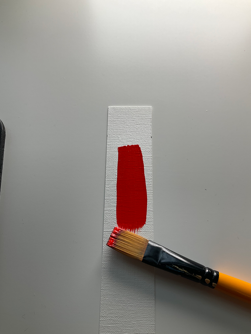
Some reds are deep and dramatic. Others are warm and earthy.
And then there are reds that simply bring energy to a painting.
For me, Golden Naphthol Red Light is that kind of red.
Bright and Warm
Naphthol Red Light is a wonderfully bright, orange-leaning red.
Golden describes it as a very bright, orange-ish semi-transparent red and notes that it is a good alternative to Cadmium Red Light.
That warmth makes it incredibly useful when I want a red that feels sunny, lively and energetic.
Fantastic for Mixing
One of my favourite things about this red is how easily it can push other colours toward warmth.
It is especially useful when I’m mixing oranges. Add yellow and the colour can become wonderfully bright and cheerful.
It can also be used to warm other reds or create a range of coral, peach and warm pink colours when mixed appropriately.
Bright Without Feeling Heavy
Because Naphthol Red Light is semi-transparent, it doesn't have the same heavy presence as some very opaque reds.
That gives me flexibility.
I can build it up, mix it into other colours or use it as part of a more transparent layer.
A Great Alternative to Cadmium Red Light
I also appreciate that Golden offers Naphthol Red Light as an alternative to Cadmium Red Light.
For artists who want that warm, bright red character, it is a really useful option.
Why It Has Become a Favourite
This is one of the colours I reach for when a painting needs warmth and energy.
Bright orange-ish red
Warm and lively
Excellent for mixing oranges
Useful for warm reds and pinks
Semi-transparent
Good lightfastness
A great alternative to Cadmium Red Light
If you love colourful, energetic paintings, Golden Naphthol Red Light is a red worth exploring.
It has a way of making the colours around it feel happier—and sometimes a painting just needs a little more happy!
You can find it on Amazon here:
1 ounce / 30mL https://amzn.to/4xSGpoO
4 ounce / 119mL https://amzn.to/4ikAu7h
8 ounce / 237mL https://amzn.to/3Sln7Ju
As an Amazon Associate I earn from qualifying purchases.


Comments