


Why I Love Hansa Yellow Opaque Acrylic Paint
Updated: Aug 27
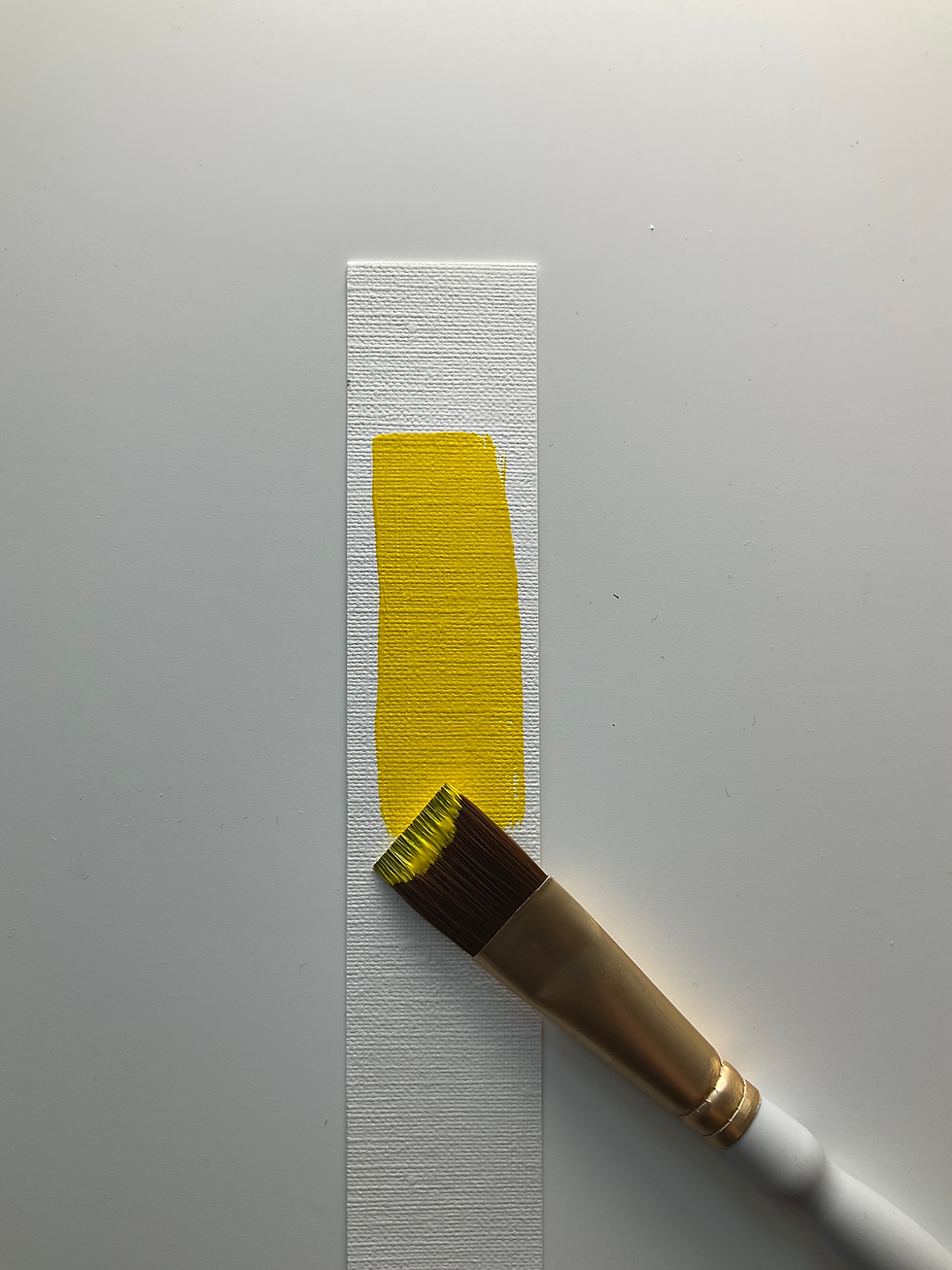
Yellow can be one of those colours that is surprisingly tricky to get right. Some yellows can feel too transparent, while others become chalky when mixed with white or used to lighten other colours. That’s why I’ve become a big fan of Golden Hansa Yellow Opaque.
It has quickly become one of my go-to yellows when I want strong coverage, bright colour and versatility without losing that lively, vibrant quality I’m looking for in my paintings.
Opaque Without Being Chalky
The thing I noticed first about Hansa Yellow Opaque is how beautifully opaque it is. It covers really well, which is especially helpful when I’m working over another colour or building up shapes in an acrylic painting.
But what I really love is that it doesn’t have that heavy, chalky look that some opaque colours can develop. It still feels bright and alive.
Bright, Vibrant Colour
This is a wonderfully bright yellow that brings energy to a painting. Whether I’m using it straight from the tube or mixing it with other colours, it holds onto that brightness.
For the colourful, bold paintings I enjoy creating, that vibrancy is important. I want my colours to feel fresh and energetic rather than muted.
A Great Mixing Yellow
Hansa Yellow Opaque is also a fantastic mixing colour.
I especially like using it to lighten greens and oranges. Instead of adding white and potentially making a colour feel pastel or chalky, adding Hansa Yellow Opaque can lighten the colour while keeping it warm, colourful and vibrant.
It’s a small change, but it can make a big difference in a painting.
I find it particularly useful when I want to create lighter greens that still feel fresh and lively, or brighter oranges that retain their warmth.
It Blends Beautifully
Another reason this yellow has earned a spot in my paint collection is how well it blends with other colours.
When I’m working in acrylic, I often want to transition between colours or create variations within a shape rather than having everything look like one flat block of colour. Hansa Yellow Opaque blends easily and gives me lots of flexibility.
It can be used boldly, mixed into other colours, or worked into a painting to create subtle variations.
Why It Has Become a Favourite
For me, a good yellow needs to do more than simply be yellow. I want it to cover well, mix well and add brightness without taking over the colours around it.
Golden Hansa Yellow Opaque checks all those boxes for me:
Opaque without looking chalky
Excellent coverage
Bright and vibrant
Blends beautifully
Great for mixing
Lightens greens and oranges while keeping them lively
If you’re looking for a versatile yellow acrylic paint that gives you good coverage while keeping your colours bright and energetic, Hansa Yellow Opaque is definitely one I would recommend trying.
It has become one of those colours that I reach for again and again — and when a paint earns a permanent place on my palette, I know it’s a good one!
You can find it on Amazon here:
1 ounce / 30mL https://amzn.to/3TOd4gI
4 ounce / 119mL https://amzn.to/4wpdtUr
8 ounce / 237mL https://amzn.to/4qegVzM
16 ounce / 473mL https://amzn.to/3RIQ4z3
As an Amazon Associate I earn from qualifying purchases.


Comments